
· Matt Ballek · 9 min read
Astra First Look: I Redesigned My Website at Chicago Jazz Fest
A walk around Chicago turned into a real-world Astra test: a new homepage, clearer tool tiers, a more personal About page, and a footer that finally knows when to stop.

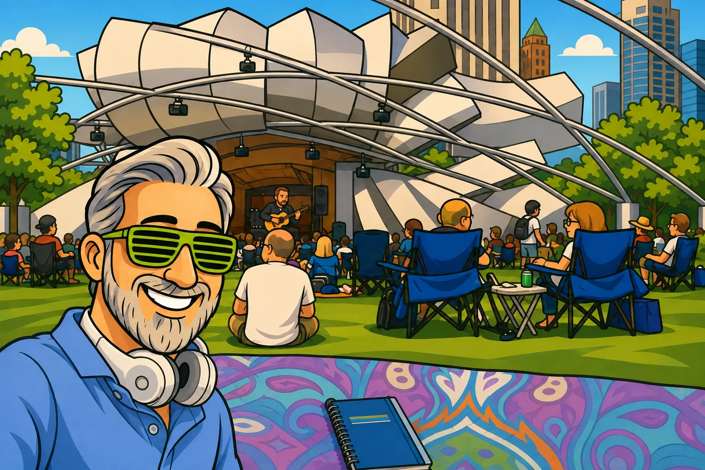
I spent the day walking around Chicago, listening to jazz in Millennium Park, and redesigning this website with Open AI’s latest model Astra.
There was a notebook (the paper kind). There was a very colorful blanket. There was a slice of pepperoni pizza that deserved my full attention.
The website got some of that attention too thanks to my phone and ChatGPT remote.
By the end of the day, we had redesigned and tested the homepage, About page, tool tier pages, and global footer. Real changes to the site you’re reading, made while I was out enjoying the city.
My first look at Astra involved considerably more grass than most model reviews.
What is Astra, and what was I testing?
Astra is OpenAI’s GPT-6 model. OpenAI describes it as its most capable model for work including coding, reasoning, computer use, and research. You can find the specifications in the official GPT-6 Astra documentation.
I was using Astra through Codex to work on my existing website. Astra is the model, and Codex gives it access to the project and tools for making and checking changes. The illustrations involved an image-generation tool too. This was a whole workflow, with me still making the calls about what belonged on my site.
I wanted to see whether we could take the things that bothered me about the site and actually fix them. The flow. The boxes inside other boxes. The parts that looked fine until you tried reading them on a phone.
This is a first look from one day on one project. I didn’t run competing models through the same tasks or measure cost per finished change. What I can show you is what we accomplished, where I had to steer, and why the experience was useful.
The plan started in a notebook
My handwritten list started with two very practical goals:
- Homepage: a more logical flow, fewer boxes, and fewer redundant links.
- Tier pages: more readable tiers and a navigation menu.
Further down were Task Man updates, Vibe Lounge ideas, and an Astra review blog post. The classic to-do list maneuver: finish a task by adding three more.
The public website became the focus. The About page and footer joined the day’s work; the bigger app ideas could have their own turn. This post is me getting to that last notebook item.
The useful part of that list was how ordinary the requests were. I didn’t need to specify a CSS layout. I needed to explain what felt confusing and what I wanted a visitor to understand.

What we actually changed
A homepage with somewhere to go
The old homepage had accumulated a lot of ways to click things. Individually, they made sense. Together, they made the page feel repetitive.
The new homepage follows a simpler order: meet me, see what I’ve built, find tools for your own project, and catch up on recent posts.
Task Man and CiteMap now help explain the site through actual projects. One is my to-do list turned into a game. The other grew out of a problem from my SEO work. They tell you more about what I do than another generic box promising the wonders of AI.
We also refreshed the Chicago Riverwalk artwork and kept the day/night versions. The goal was to make the site easier to follow while keeping it recognizably mine.
Tool tiers you can actually read
The tier pages had a similar problem: too many nested containers near the top, followed by a different visual rhythm further down.
We opened up the layout and made the tool names and ranking reasons visible in the tier rows. That’s a useful change on a phone, where hovering over a little logo is not much of a plan.
The new menu lets you jump to the tiers, find your fit, read the tool breakdown, or get into the guide. I especially liked that addition. These pages have a lot of information; giving people a way to move through it makes the length more manageable.
There was a follow-up, though. The guide text was narrower than the surrounding sections, and it looked out of place. I pointed that out, and we made the widths consistent.
You can see the result on the database guide or start-building guide. Because this was a shared template, the improvements carried across all six related pages. The rankings themselves still live in the same markdown files.
An About page that looks and sounds like me
The About page needed a clearer story about my background in SEO, the move into building with AI, and the projects that came out of it. We revised the flow and copy and brought more of the site’s purple styling into the page. Astra leaned away from the standard purple design vibes, but I love purple regardless of how hack it is.
Then there was Cartoon Matt.
The About portrait looked too different from the homepage character. I wanted the same guy, wearing normal glasses. Apparently, asking to recognize myself on my own website was going to require a few notes.
We worked through the eyes, facial detail, and shading. The dark portrait also developed a strange surface texture that needed another cleanup pass.
That was a useful reminder: an image can be finished generating and still need work. I had to look at it and say what felt off. The final portraits are more consistent, but we got there through revisions.
A footer that stopped going on forever
I liked the footer artwork. I did not like how much scrolling came with it on mobile.
We kept the light and dark images, removed the bulky preview cards, and reorganized the links into two columns. Social and legal links became more compact, and we added a back-to-top link.
In the mobile check at a 390-pixel viewport width, the footer went from roughly 1,890 pixels tall to 680 pixels. About 64% shorter.
That is a layout measurement, not a claim about traffic or conversions. But it is a very satisfying answer to “why am I still scrolling through the footer?”
The checking was part of the work
Across these changes, we ran production builds and Astro checks, reviewed desktop and mobile layouts, and checked light and dark mode. The homepage’s 17 internal links were checked against the generated pages. The tier-page work and footer also went through targeted code checks.
The guide width needed a correction. The portrait needed revisions. The footer needed to be viewed at phone size. Those were all part of getting the work finished.
I wasn’t simply asking for four redesigns and trusting the first response. I was reviewing results and giving the next bit of direction as the day went along.
What impressed me about this first look
The range of work is what blew my mind.
We moved between page structure, copy, shared components, artwork, mobile usability, and testing. Those are connected jobs that tend to pile up when you’re building a website by yourself.
Astra, working through Codex, helped me move through that pile while I was pretending to appreciate jazz. I could describe a problem in normal language (people on the street just thought I was having a boring phone call), look at a concrete result, and refine it.
I’ve already written about updating this site from a train with Codex. That was exciting because I could keep a project moving during a commute. Today pushed the idea further: several substantial improvements over the course of exploring the city.
I even got to sit down this time. On the ground, but I’m counting it.

What I would keep in mind before trying this
The project already existed. Codex had the files, the site’s conventions, my computer running at home, and instructions about the voice and design. We had a starting point and a way to check the results.
If you’re trying Astra on your own project, I’d start with one page and one clear problem. Something like:
Review this page and simplify its flow for a first-time visitor.
Keep my existing content and visual identity.
Reduce repeated links and unnecessary containers.
Implement the changes, run the normal build,
and check the result on mobile and desktop in both themes.
Summarize anything that still needs my attention.
That’s an example based on the day’s work, not a verbatim transcript. The important ingredient is a result you can recognize and review.
I also wouldn’t use this day to claim Astra is cheaper or faster than another model (I ended up using 2 banked resets on the Plus plan while testing differnt model strengths). I didn’t measure that comparison. For now, the evidence I care about is the set of useful changes we finished, with the necessary corrections along the way.
My first impression of Astra
For this kind of ongoing website work, I’m cautiously hopeful.
The homepage tells a clearer story. The tiers are easier to read. The About page feels more personal. The footer takes up much less of your phone.
And I still got a day in Chicago, some live jazz, and a slice of pizza.
That’s the part I want more of: being able to act on an idea when I have it, keep the work moving, and still enjoy the place I’m in.
The notebook still has unchecked boxes. Of course it does.
But this website is better, and I didn’t spend the whole day in my chair. However, I did burn through more usage in a day than if I used yesterday’s model.
Yesterday I was worried about overusing the power of the sun, now I have access to the power of time and space.
The illustrations in this post were generated from my photos of the day, using the homepage artwork as a style reference.