
Mitch Ivin XP: A Portfolio That Boots Like Windows XP
A visual designer portfolio that turns the whole website into a working Windows XP desktop, complete with boot flow, apps, taskbar, and tiny nostalgic details.
 Cursor
Mitch Ivin’s portfolio is the kind of project that makes you stop pretending every portfolio needs the same hero, headshot, services grid, and polite button.
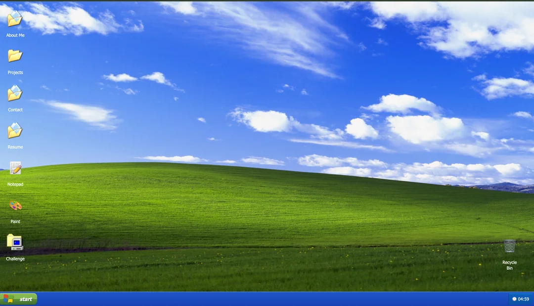
It boots. It logs in. It gives you a Windows XP-style desktop with apps for About Me, Resume, Projects, and Contact. There is a taskbar, a start menu, a system tray, a full-screen nudge, and enough tiny interface decisions to make you feel like you found a CD-ROM in a drawer.
That is the point. This is not just a portfolio with an old-school skin. It is a portfolio where the interface is the portfolio.
Fast read
| Field | Notes |
|---|---|
| Project | MitchIvin XP |
| Creator | Mitch Ivin |
| Team size | 1 |
| Listed AI code contribution | 100% |
| Listed tool | Cursor |
| Core stack | HTML, CSS, JavaScript |
| Backend | None listed |
| Source status | Mitch’s GitHub note says the current source is private because of copied, broken versions |
What MitchIvin XP Is
MitchIvin XP is an interactive portfolio that recreates the feeling of using Windows XP in the browser. The accessible fallback on the live site describes a boot sequence, a user login, desktop applications, a taskbar, a start menu, and controls like restart, log off, CRT toggle, and fullscreen.
That matters because the gimmick actually supports the goal. A visual designer does not need a portfolio that says “I care about interaction detail.” This site demonstrates it before you read a sentence.
Why MitchIvin XP Works
The obvious reason is nostalgia. Windows XP is instantly legible to a lot of people who grew up online, and it carries a specific emotional texture: chunky controls, bright blues and greens, little status icons, and the feeling that everything is a tiny object you can poke.
The better reason is commitment. The project does not stop at “blue taskbar plus desktop icons.” It has a boot moment. It has a login moment. It has windows. It has app destinations. It has enough fake operating system behavior that the portfolio becomes something you explore instead of skim.
That is the lesson worth stealing: if you choose a metaphor, go deep enough that the metaphor becomes the navigation system.
The vibe coding angle
The structured project listing says the project was built with Cursor, using HTML, CSS, and JavaScript with no backend. It also lists team size as 1 and AI code contribution as 100%.
Mitch added more useful context on Hacker News: he described starting without coding experience, spending months collaborating with AI agents, and reviewing every pixel and function himself. He also noted that he did not use a full existing OS framework; outside of libraries like xp.css and paint.js, the implementation was original.
That distinction is important. “AI wrote the code” does not mean “the human disappeared.” This project looks like the result of someone with strong taste using AI as a translation layer between intention and implementation.
What builders can learn from it
1. Taste is still the moat
A coding agent can help create windows, buttons, state, event handlers, and animations. It will not automatically know which small details make a fake OS feel alive.
This project feels sharp because the taste loop stayed human: notice a detail, ask for it, test it, reject what feels wrong, repeat until the thing has a point of view.
2. A portfolio can be a product demo
Most portfolios describe ability. This one behaves like evidence.
For a visual designer, that is a smart trade. Even if a recruiter only spends 30 seconds with it, the site communicates interaction design, visual memory, patience, and technical curiosity faster than a normal case-study grid.
3. Scope can be playful and still disciplined
The site does not need accounts, a database, payments, or a dashboard. It is a front-end environment with a very clear job: make people want to click around and remember Mitch.
That is a good reminder for vibe-coded projects. More app is not always more impressive. Sometimes the better move is to make a smaller surface feel unusually complete.
4. Novelty needs utility
The XP wrapper would get old fast if it hid the actual portfolio. But the desktop apps map cleanly to normal portfolio jobs: about, resume, projects, contact.
The lesson: weird navigation is fine if the user can still infer where to go.
Tool notes
The named tool here is Cursor, which makes sense for this kind of project. You need an agent/editor loop where you can keep asking for small interaction fixes, inspect files, and keep nudging the UI toward the reference in your head.
For builders attempting something similar, I would treat Cursor as the coding partner, not the art director. Bring references. Name the tiny details. Ask for one behavior at a time. Then click around like a person who is trying to break the illusion.
What I would want to know from Mitch
- How many major rebuilds did the desktop/window system go through?
- Which parts were easiest for AI to generate?
- Which parts took the most human correction?
- How did he decide when the recreation was “faithful enough” versus just distracting?
- How many Cursor requests did this thing consume? Scientific curiosity, obviously.
Sources
- Reddit discovery thread — Where I found it
- MitchIvin XP live portfolio — Where I clicked around and tested the experience
- Vibe Coding Award project page — Where I pulled the quick facts
- MitchIvin XP GitHub repository — Where I checked the source-code note
- Hacker News launch thread — Where I found more creator context
Built this, Mitch Ivin?
Mitch, if you want to add a creator quote, correct the stack notes, or share how many Cursor requests this took, I would love to make this showcase more accurate.